
 We won our blog battle! We're now voted best creative blog at battle of the blogs. A big thank you to everyone who voted for us and enter your own blog here.
Monday, November 30, 2009
Champion
We won our blog battle! We're now voted best creative blog at battle of the blogs. A big thank you to everyone who voted for us and enter your own blog here.
Friday, November 27, 2009
Sophie Lancaster Video
Back in May we entered the DMA GRT Awards. The brief was a toughie, to change perceptions of young people to become more tolerant of one another - for the Sophie Lancaster Foundation. Sophie Lancaster was a victim of hate crime - she was kicked to death by a gang of boys because she looked different. So the topic was very emotional.
We were shortlisted for the award and on the day we had a series of one to one feedback with the judges. It seemed that our work was not emotive enough and that we should have made more of Sophie's story - which was true.
And today on Creative Review I see the video Propaganda have made for the organisation, which will be played on MTV.
It's made beautifully, the music is perfect and it's a great cause with a great message, but is that enough?
For a story so horrendous, the scene where the couple are attacked is such a minor part. With using animation especially, it seems they could have made more of it.
The task is so huge, will it really make the MTV audience stop and think?
Thursday, November 26, 2009
Return to the Doghouse
Possibly the best Christmas campaign I've ever seen, Saatchi & Saatchi's JC Penney ad is back for another year - Return to the Dog House.
From the insight of men not knowing what to by the women in their life at Christmas time, JC Penney brings you the answer - jewelery. Other wise you'll be in the doghouse. Simple and funny.
I'm sure last year there was a section on the website of people in the doghouse with photos of themselves but can't see it as of yet. Check out the Doghouse here
Tuesday, November 24, 2009
Works. Doesn't work.

Although it works perfectly for the idents i am not so sure about the static logo, it almost seems like its from the stock photo library. Dull and generic. It will be interesting to see what this looks like when it is released. Time to order a free aol cd and pretend i'm interested in using them.
See the videos here
See the logo here
Monday, November 23, 2009
Battle of the Blogs

By the way, this week we are in battle of the blogs so please vote for us if you like our style: http://www.thebattleoftheblogs.com/
Tis the season to be jolly

It seems like the Christmas work keeps coming thick and fast in adland, saw these fantastic, simple lynx ads by BBH earlier today and they made me smile instantly. There is three that i have seen with the one above my pick of the bunch, i just like the bum cheek prints so much in that one. Another thing to note is the simple use of putting a Christmas glove on the hand of the model and also the way the type just wraps around the glove. Very nice, very nice indeed! view the rest here
Another that caught my eye is the Christmas McDonalds advert by Leo Burnett, check it out here. It looks like myself and Laura are looking forward to Christmas as there seems to be a lot of festive posting going, all this festive goodness surely secures Santa coming down my chimney.
On another note Charles Saatchi's version of the x-factor for artists is on tonight, BBC2 9pm. Will post thoughts tommorow.
Friday, November 20, 2009
Channel 4 1d week
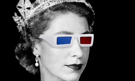
So it was channel 4 3d week this week, where images would literally pop out of the screen at you and make you feel as if you could touch the queen (careful!) Unfortunately that didn't quite happen, the whole house suddenly found out we could see the footage better without the stupid glasses on.
After the wonderfully dull Queen in 3d programme came Derren Brown's magic show, something which everyone thought would embrace the world of 3d and take advantage of it. Or not. The one bit that even caught my attention was the card trick were the cards literally flew at you and you were told to choose a card, it was really neat but unfortuately it was already on the advert. Basically the whole show was a best of magic from around the world with 'so called' 3d imagery. To put it in advertising terms. 'Polishing a turd'
I have nothing against 3d but to label your week 3d week and show programmes that would be better in 2d makes no sense whatsover. None of the two mentioned above utilised 3d at all to it's full advantage. If utilised correctly the feature could be brilliant but obviously not right now.
Subscribe to:
Posts (Atom)